07 March 2015
The Concealed Life
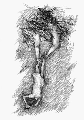
These are some of the drawings I have created whilst trying to develop the visual aesthetics for the graphic novel I am in the process of writing.
I think that colour may appear in the panels that I want to symbolise a drastic change in atmosphere.
But for the majority of the book I want to use blank and white, focusing instead on the intensity in the tones and the movement creates by the pencil.
I have decided to use lettering created by rubber stamps because of the crooked quality that comes with inking each letter and stamping it.
In this drawing I start succeeding in making the drawings more loose and expressive and distorting the proportions so that the world I am recreating becomes unique but it is still recognisable.
I created a few pen drawings and then dismissed the media because it did not create the intense movement I am after.
In these last two drawings I created the style that I want use in the book. The proportions are distorted, from the figures to the scenery. One character has been transformed into a God like status because of their power within the narrative.
06 March 2015
Subscribe to:
Comments (Atom)


