09 September 2016

Sophronia Exhibition

The exhibition, Sophronia, presented the works of MA Authorial Illustration students at Falmouth university. I exhibited the graphic novel Mongrel, which I wrote on the course.

I was awarded the Atlantic Press Graphic Literature Prize, for the work I created in Mongrel. 


On one side of the wall I created a collage from the inner pages in Mongrel.
I did not want the illustrations to be displayed as flat images, so created books to be used in the collage. Some books were nailed open, some had flapping pages and some were nailed shut. The closed books represented hesitancy towards sharing personal narrative.


On the other side of the wall, I presented a framed original and two versions of the book. One version contained the three chapters I had managed to finalise on the course and the other version, the manuscript, contained the whole story at different stages. 


02 January 2016

Mongrel - Memories of Waterland

For every chapter I start by creating basic thumbnail drawings for every page. This helps me plan the pacing of the story as I decide how many panels will be on each page and what they will communicate. For Memories of Waterland I wanted to shape the panels  so they look like puddles. 


This chapter was slightly difficult because I couldn't figure out if I wanted the words to be kept separate from the imagery, so I created a draft with both options to help me judge. 


I decided it was best to display the poem on the first page and have a sequence of images following it.


02 November 2015

The Collaborators Exhibition


This drawing was exhibited at The Collaborators exhibition at The Exchange Gallery, Penzance.


03 August 2015

The Story Republic

I created a number of illustrations to accompany poems created by The Story Republic. The drawing were projected whilst the young writers read their poems at an event the The Exchange, Penzance.


Newlyn Art Gallery and The Exchange

On this postgraduate placement I created a booklet based on the two exhibitions, Artist Rooms: Robert Therrien and In Search of the Miraculous. As well as researching both exhibitions, I wrote, designed and illustrated the booklet. I created questions to help viewers engage with the artwork and designed creative tasks for visitors to take part in during their visit.


23 July 2015

Think & Do Booklet

On the placement with Newlyn Art Gallery I am making a gallery guide for young people aged between 13-25 years. 


At the start of the project I had the idea to create a guide that felt like an artist scrap book. A mock-up of this idea can be viewed below. I felt this idea was appropriate as the aims of this guide was to help viewers engage with the art on display, to encourage curiosity and make the gallery space less intimidating to those unfamiliar with it. I believe the warmth looseness of a scrap book design like this would encourage creative thinking. However because of the very quick turnover I had for this project, it was not possible to do this. Instead I had to opt for the quickest medium to work with which is digital media. 


Although I could not go ahead with the idea I was set on, I am pleased with the result using digital media because it has created a simple, bold look and lets the illustrations capture the focal point. The colour scheme in the font reflect the colour scheme used in the galleries branding. 


05 April 2015

Our Daily Rice

I have finalised a draft section in order to create a clear reference point for myself, using this mock-up to refer to, as it captures the narrative and illustrative voice I wish to embody through out the rest of the project. This section is at the centre of the rest of my script writing.  


07 March 2015

Finding the characters


The Concealed Life

These are some of the drawings I have created whilst trying to develop the visual aesthetics for the graphic novel I am in the process of writing. 


I think that colour may appear in the panels that I want to symbolise a drastic change in atmosphere. 
But for the majority of the book I want to use blank and white, focusing instead on the intensity in the tones and the movement creates by the pencil.


I have decided to use lettering created by rubber stamps because of the crooked quality that comes with inking each letter and stamping it. 


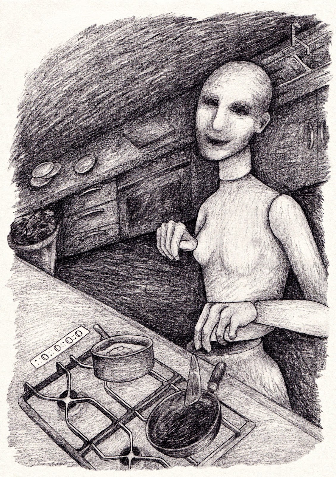
In this drawing I start succeeding in making the drawings more loose and expressive and distorting the proportions so that the world I am recreating becomes unique but it is still recognisable. 


I created a few pen drawings and then dismissed the media because it did not create the intense movement I am after. 


In these last two drawings I created the style that I want use in the book. The proportions are distorted, from the figures to the scenery. One character has been transformed into a God like status because of their power within the narrative. 

Dancing on Clouds


06 March 2015

Printmaking: Collagraph

This image was created using mountboard. Using a scalple, I cut out the shapes I wanted to be the darkest because it absorbs more ink. Then spread ink, and press onto paper. 


Printmaking: Etching

Etching using lots of chemicals on copper plate.