07 March 2015
The Concealed Life
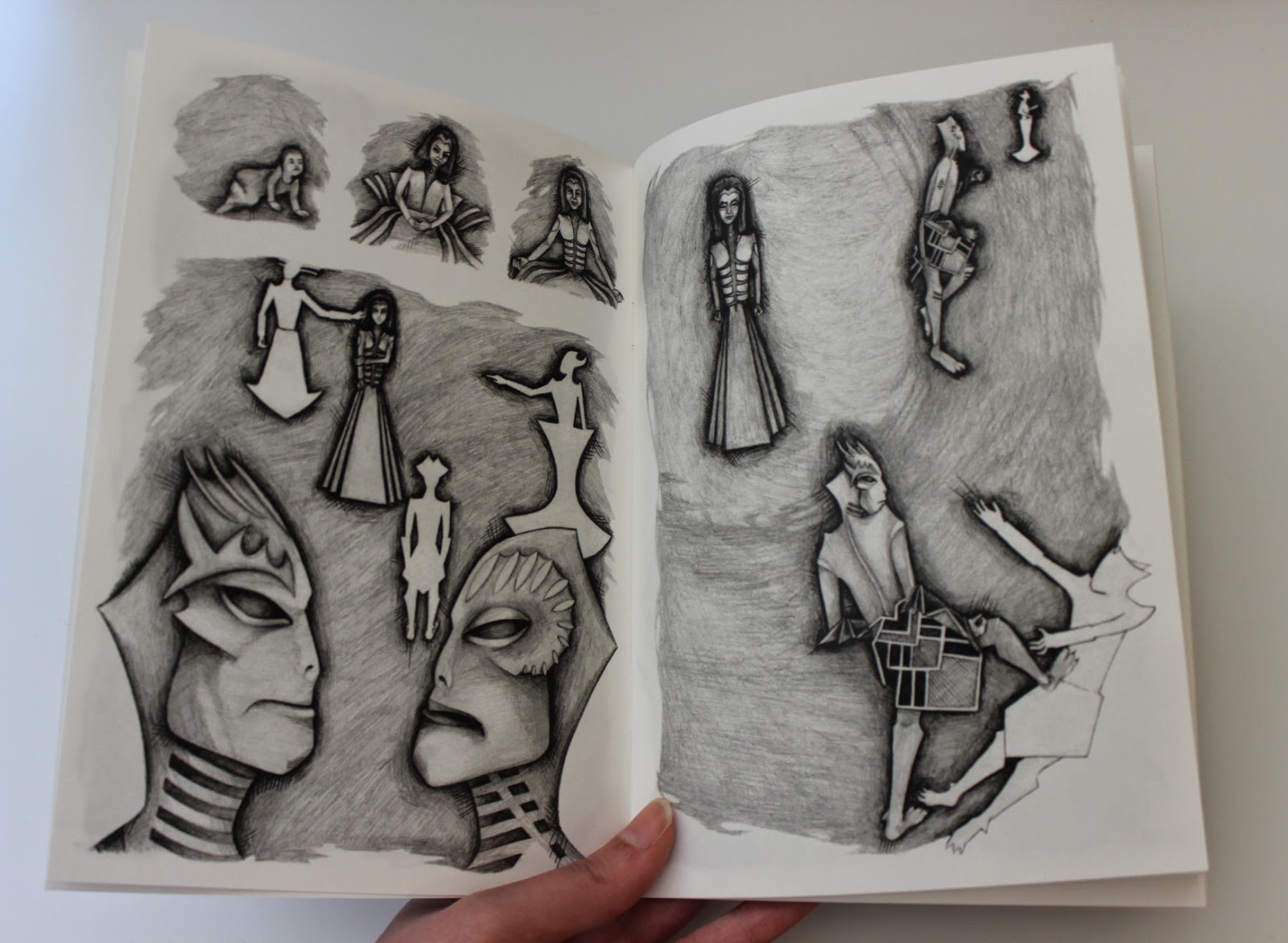
These are some of the drawings I have created whilst trying to develop the visual aesthetics for the graphic novel I am in the process of writing.
I think that colour may appear in the panels that I want to symbolise a drastic change in atmosphere.
But for the majority of the book I want to use blank and white, focusing instead on the intensity in the tones and the movement creates by the pencil.
I have decided to use lettering created by rubber stamps because of the crooked quality that comes with inking each letter and stamping it.
In this drawing I start succeeding in making the drawings more loose and expressive and distorting the proportions so that the world I am recreating becomes unique but it is still recognisable.
I created a few pen drawings and then dismissed the media because it did not create the intense movement I am after.
In these last two drawings I created the style that I want use in the book. The proportions are distorted, from the figures to the scenery. One character has been transformed into a God like status because of their power within the narrative.
06 March 2015
09 November 2014
02 September 2014
Angel of Mons
This project was a commission, in which I was asked to create a poster to accompany a piece of music, commemorating the anniversary of the ‘Angel of Mons’. In the early weeks of the Great War, a winged angel appearing to British Expeditionary troops above the battlefield, warning them to retreat.
Mock-ups
The idea behind the mock-ups (above) is to capture the energy of the angel, representing this, instead of the physical form.
Again, I have chosen to represent the angel metaphysically. A bursting ray of light shinning down on a soldier, quickly praying before he joins his comrades in the battlefield.
The mock-up above takes a more literal approach. The sky is broken, by the descending angel, revealing outer space. The path coming down from the sky symbolised the road the soldiers retreated on. Researching the 'Angel of Mons', the images of the soldiers retreating stood out to me.
The design above was chosen by the client to be finalised. In this design I choose to have an outline of the angel, not incorporating any features, as I thought this was a good balance between giving some information away but not too much.


Above are all the text layouts I experimented with before I decided on the best placement.
I thought that having the text in the silhouette of the head, subtracted too much from the background, and the text looked like it was floating too much, and the text in the background did not stand out enough.
Final Poster
22 January 2014
Estrangement
In a realistic world there are the beautiful and equally there is the ugly, both coexisting with each other, to define and appreciate the opposed. But in the strange world of Acacia, only beautiful creatures inhabit it, and everything always remains perfectly beautiful. In order to sustain this there are regulators, working out of sight from the civilians.
This silent zine tells the story of an estranged girl.
21 January 2014
Witch
These two paintings were a response to an article based on The Pendle Witch Trials. I approached these paintings with the idea to portray the women as they were accused. Visually communicating the crimes they were accused of by adding the mystical elements to the paintings, rather than portraying them as victims of persecution.
Subscribe to:
Posts (Atom)